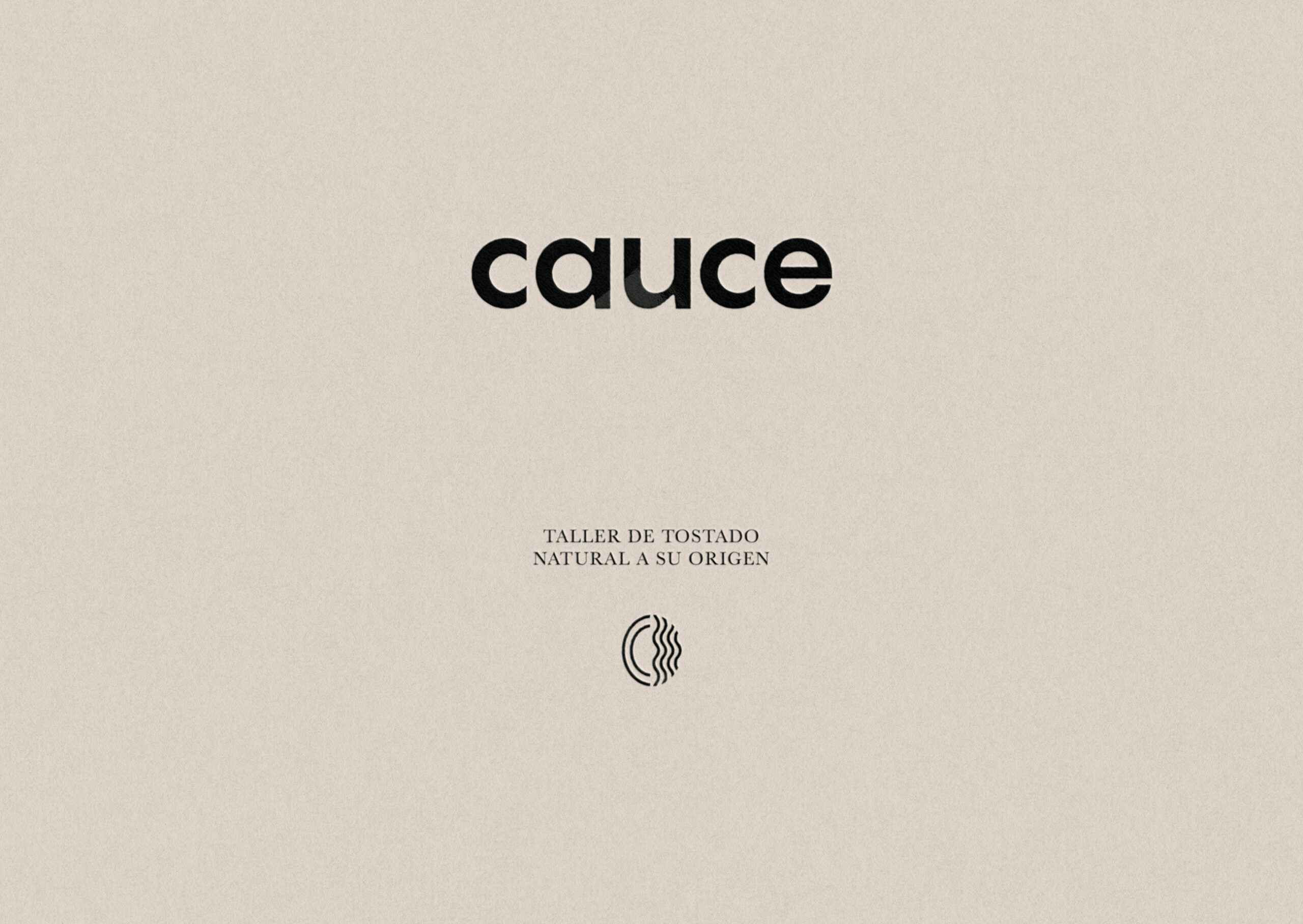
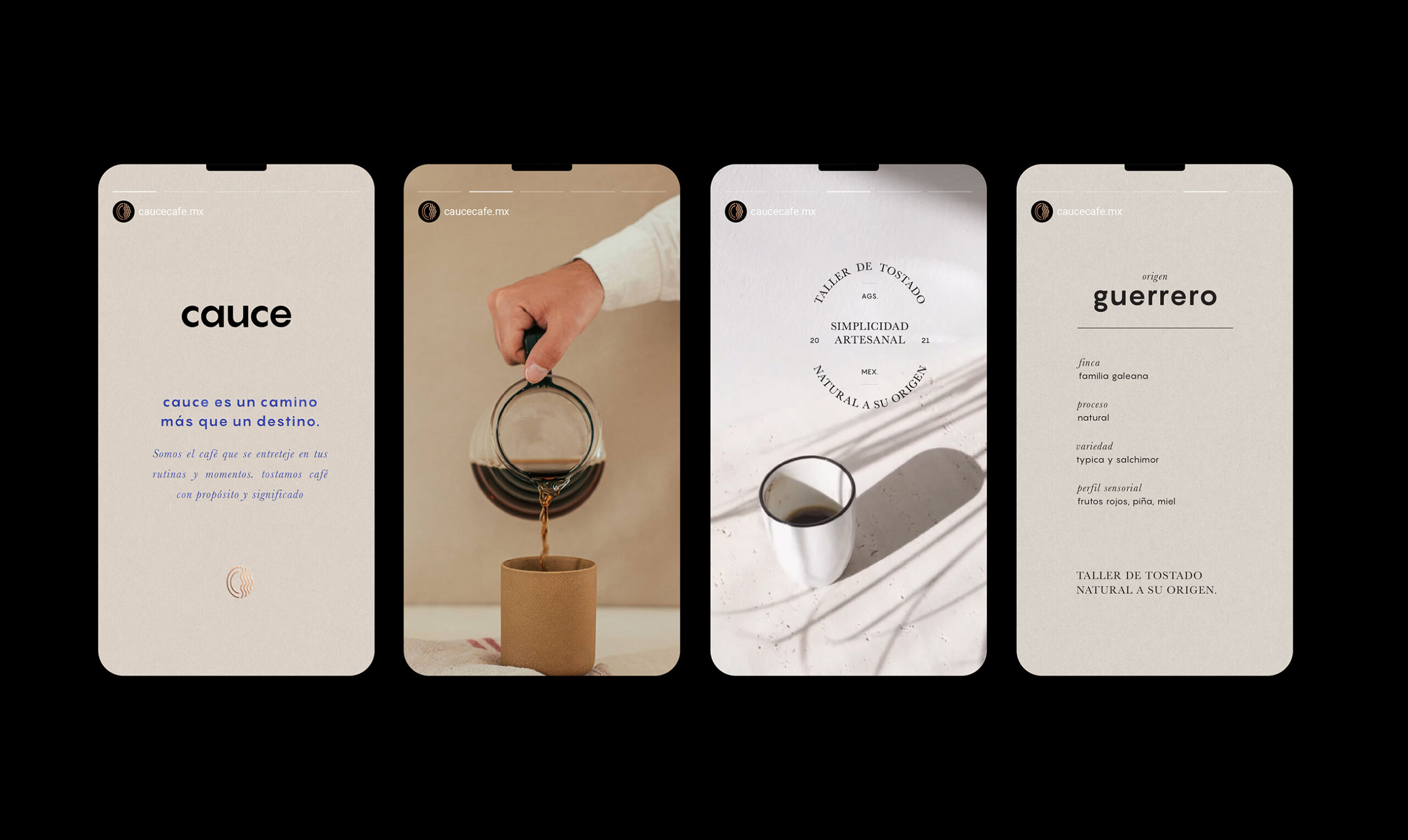
Cauce
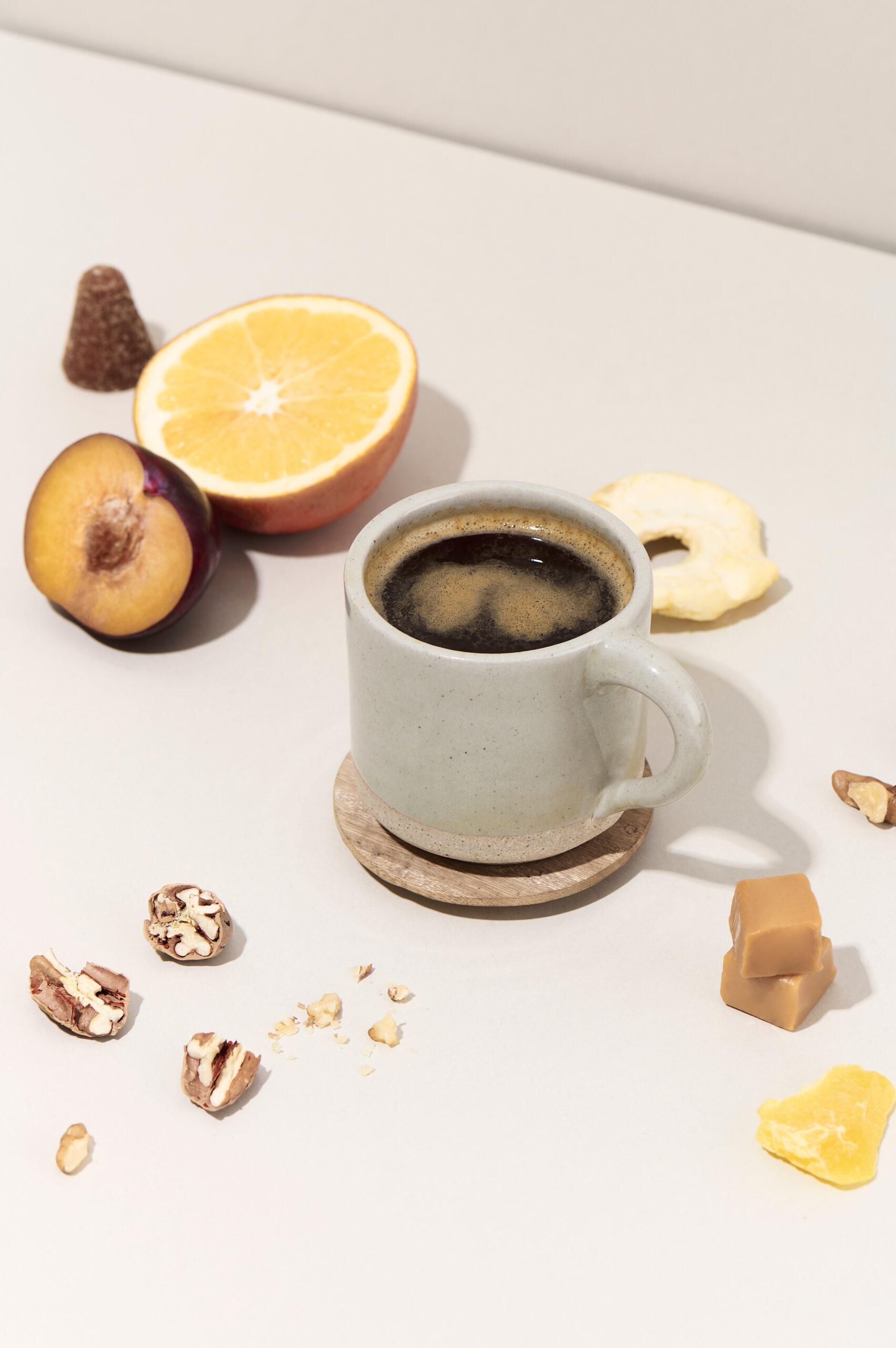
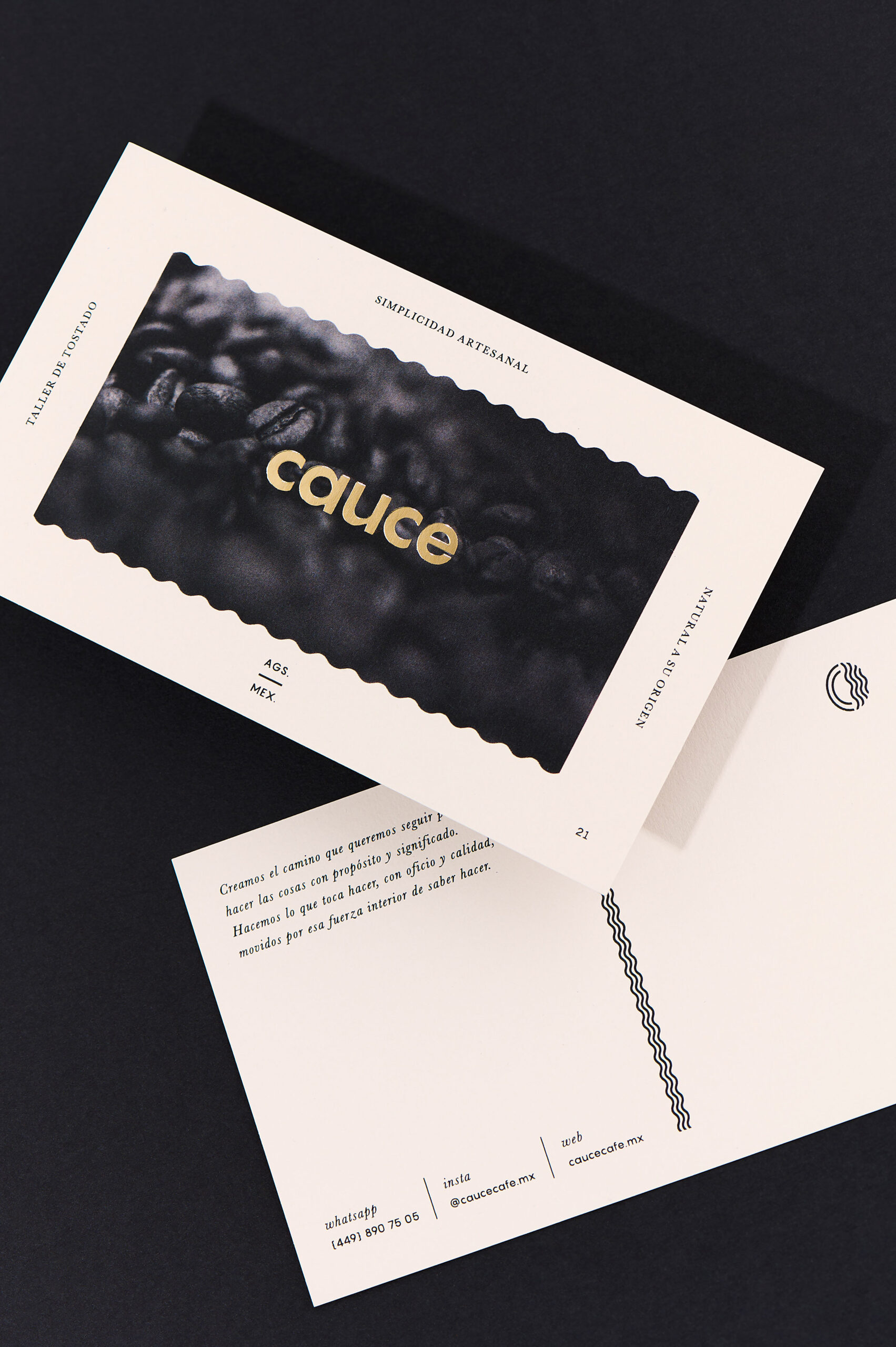
When we set out to create the brand identity for cauce, the most important message to convey was honesty, simplicity and the artistry of small-batch roasted coffee. Drawing inspiration from the Japanese concept of monozukuri, which embodies the ideas of skill,spirit, and craftsmanship in creating superior-quality products, cauce was born. Founded upon the founder's aim of a strong roasting philosophy, to accentuate distinctive flavor profiles to deliver an unparalleled organoleptic experience.
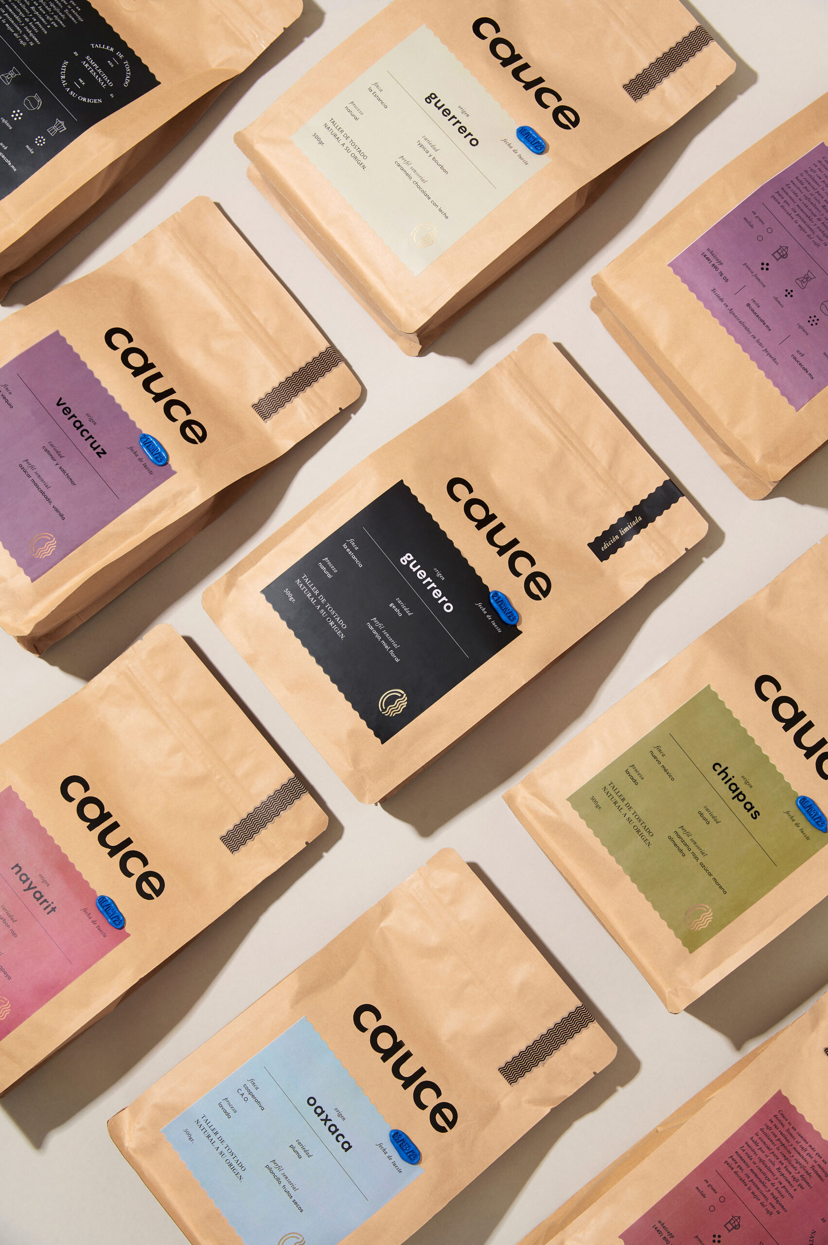
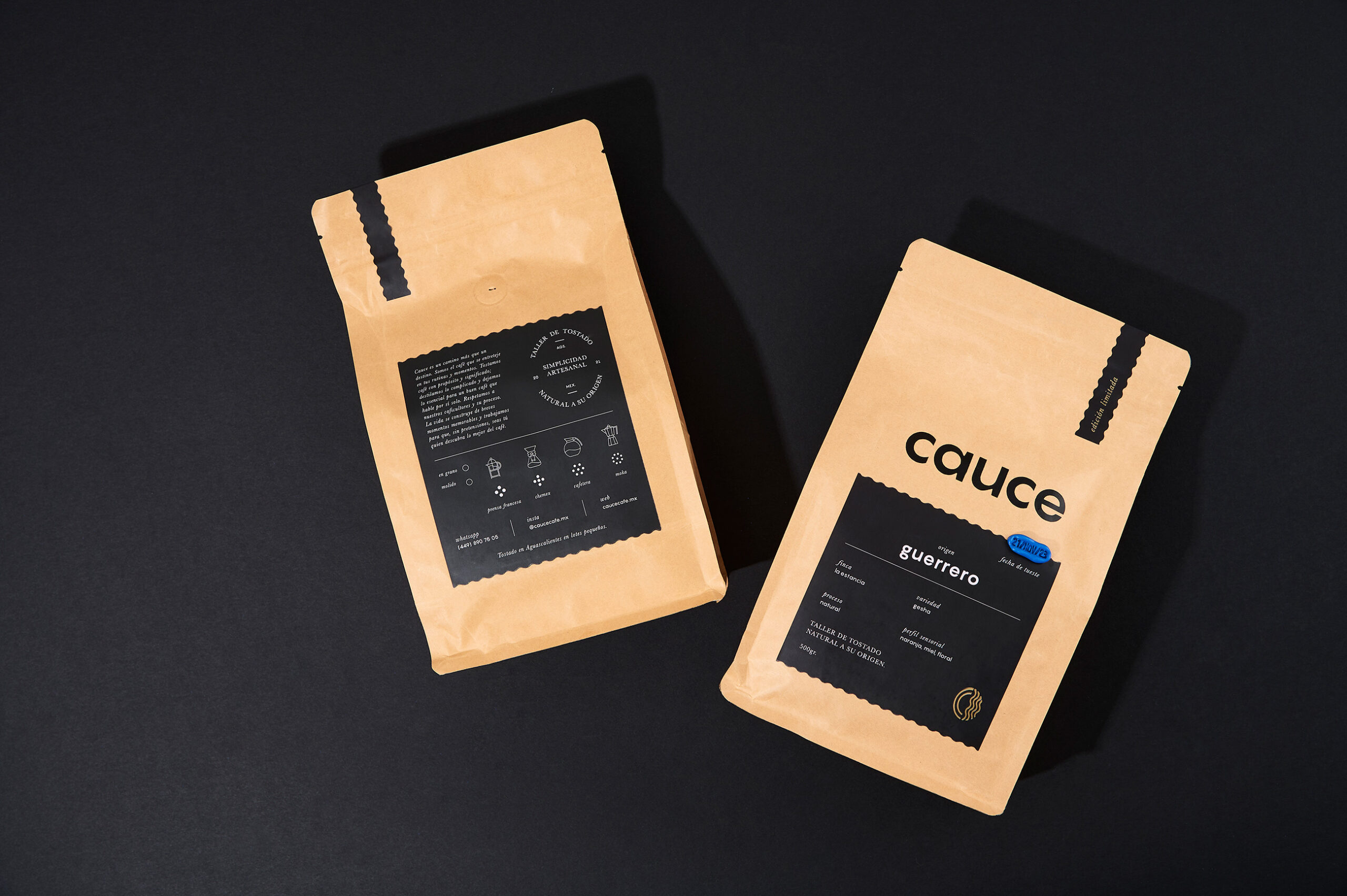
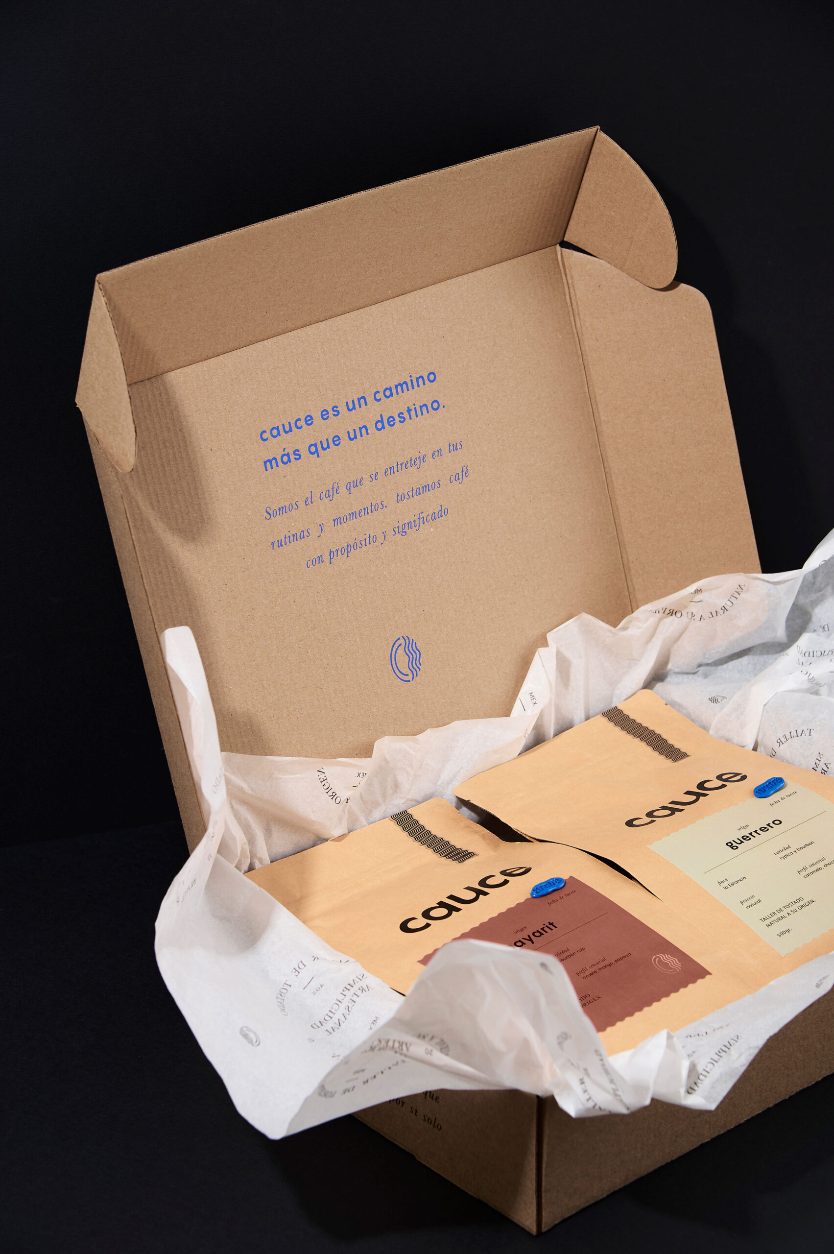
Cauce — taller de tostado natural a su origen.
SERVICES
Naming
Branding
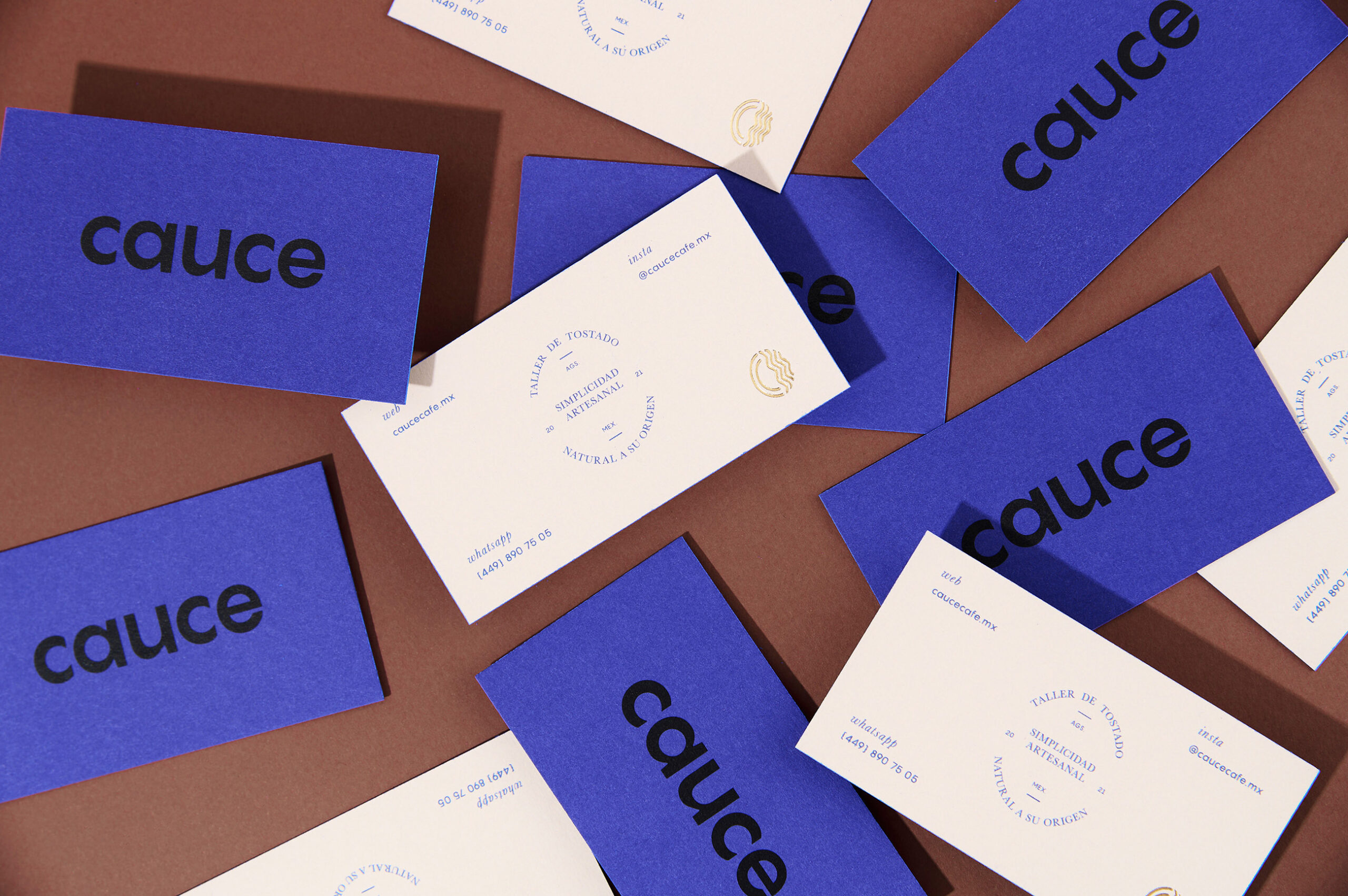
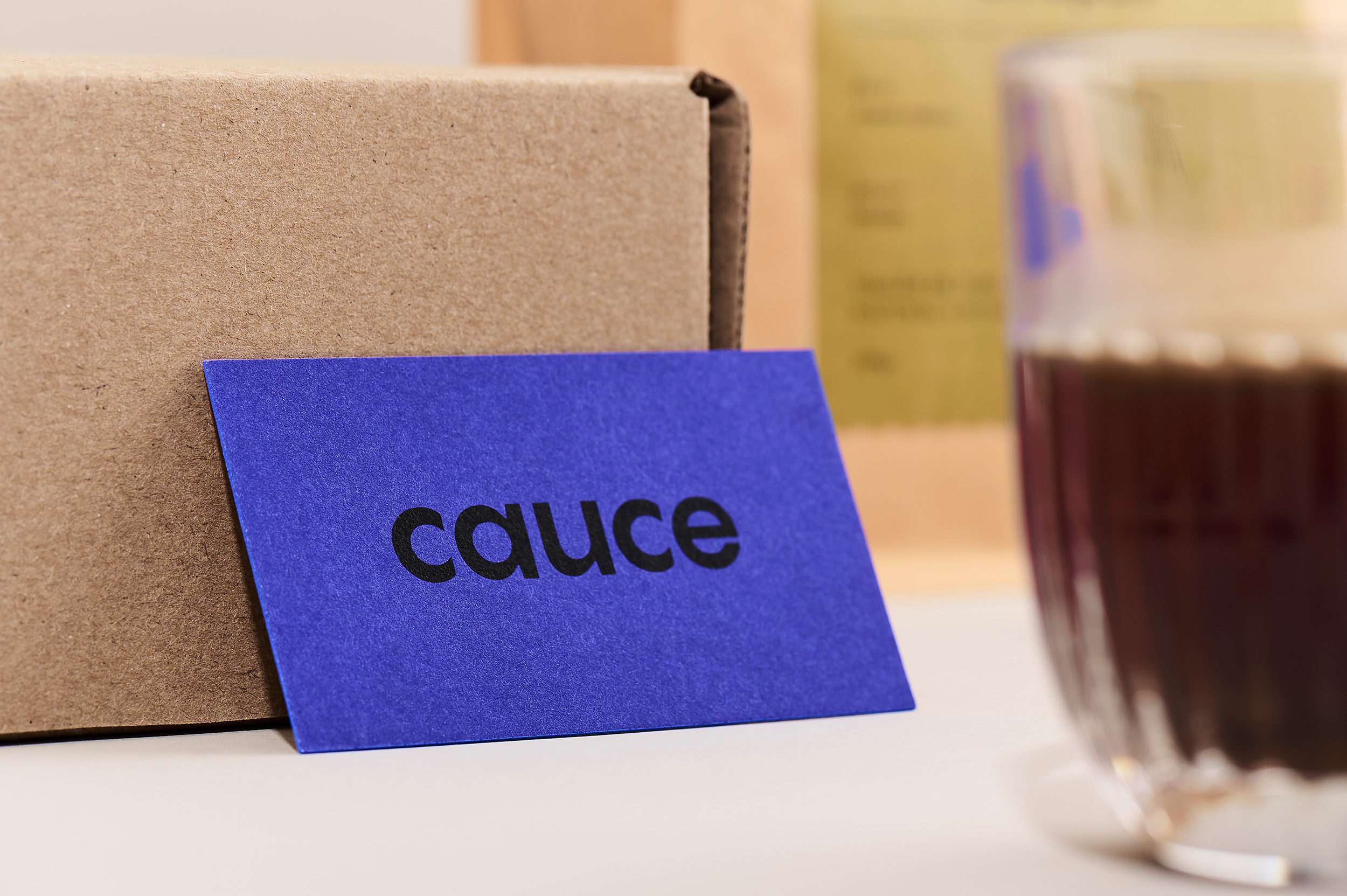
Packaging
Collateral
Social Media Kit
PHOTOGRAPHY
Liliana Barraza
EXPLORE
rarebeehive.com
@caucecafe.mx
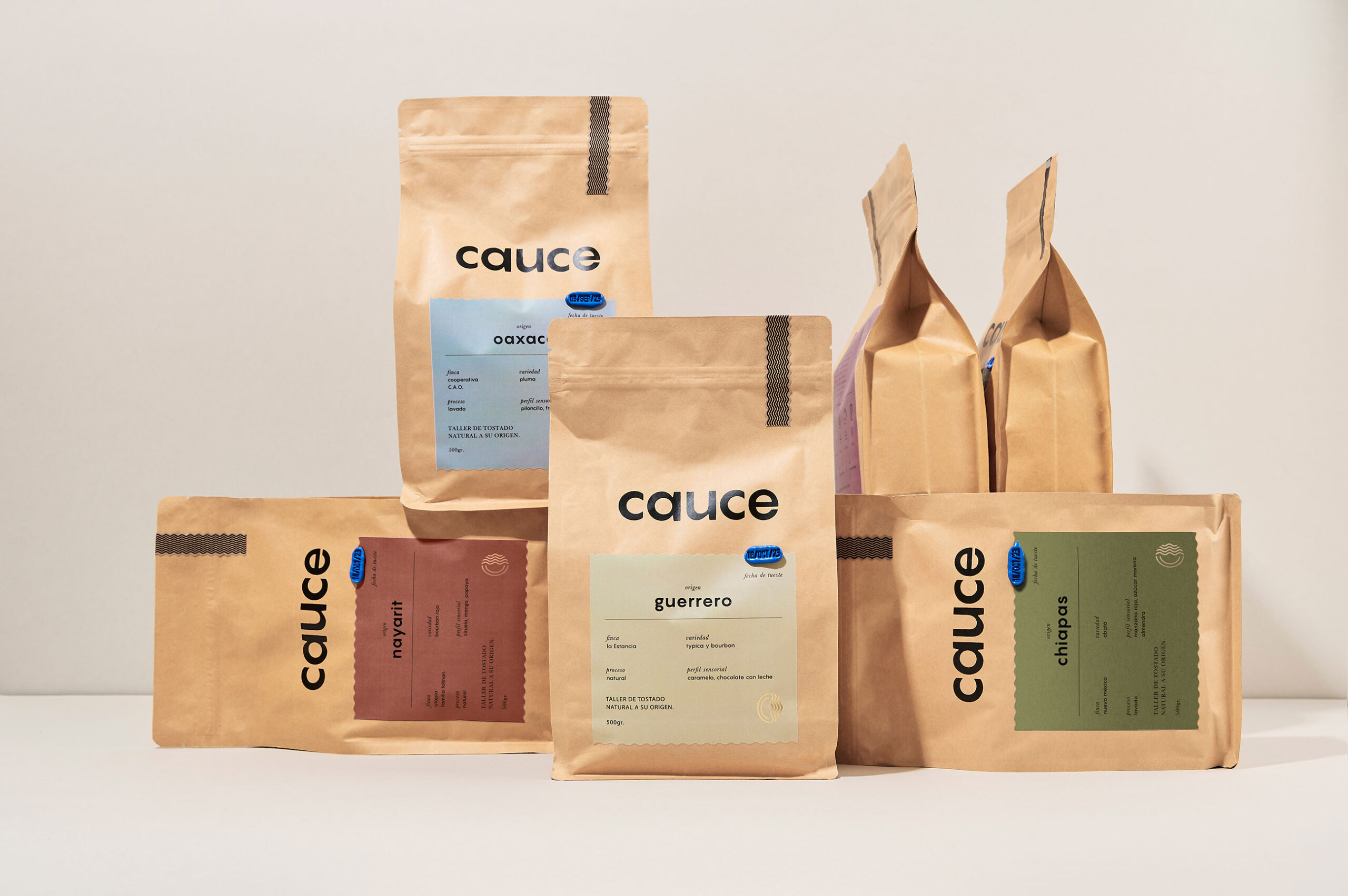
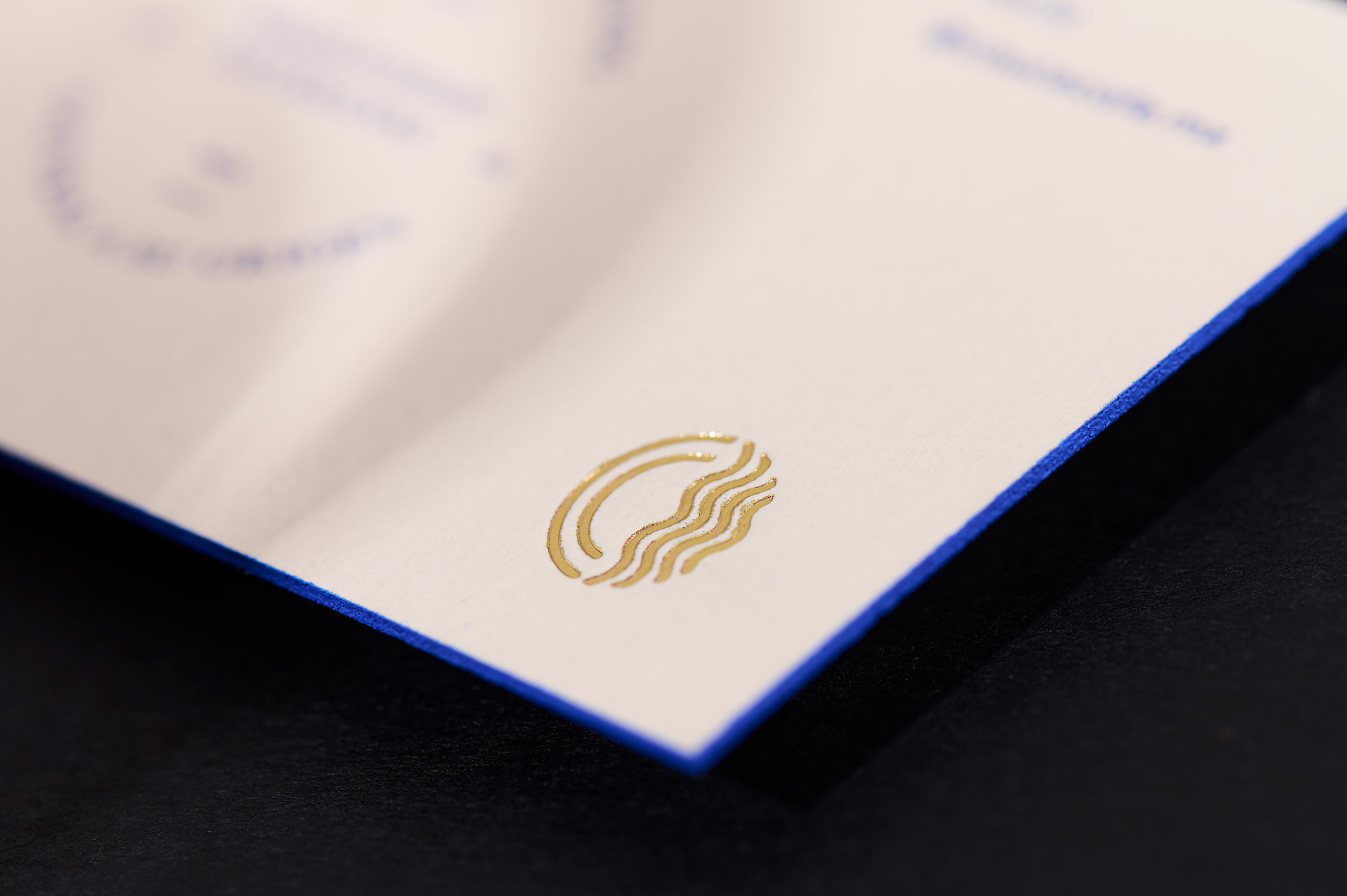
Cauce means "river bed" in Spanish. The idea behind this brand name is to capture the natural flow of things, creating a purposeful and meaningful path where form follows function, expressing this sentiment through the design details.
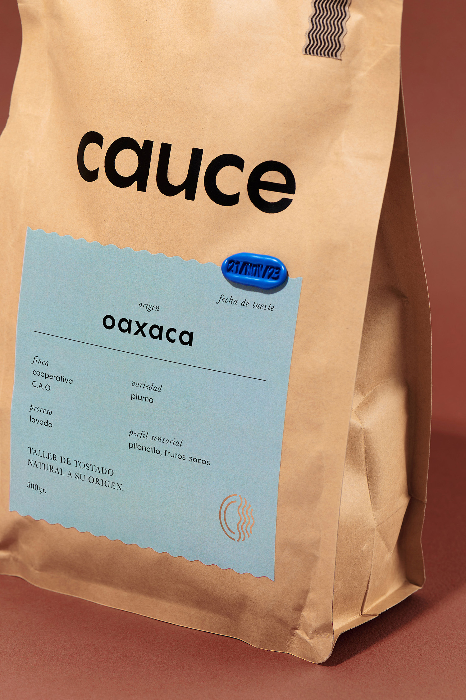
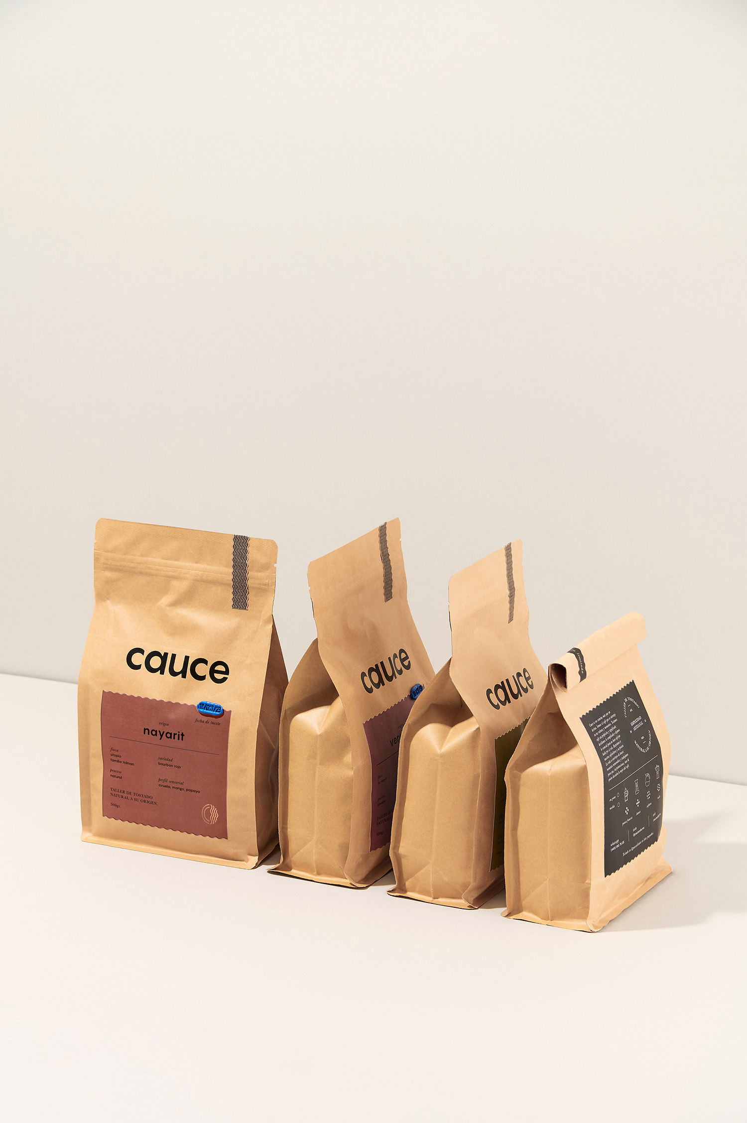
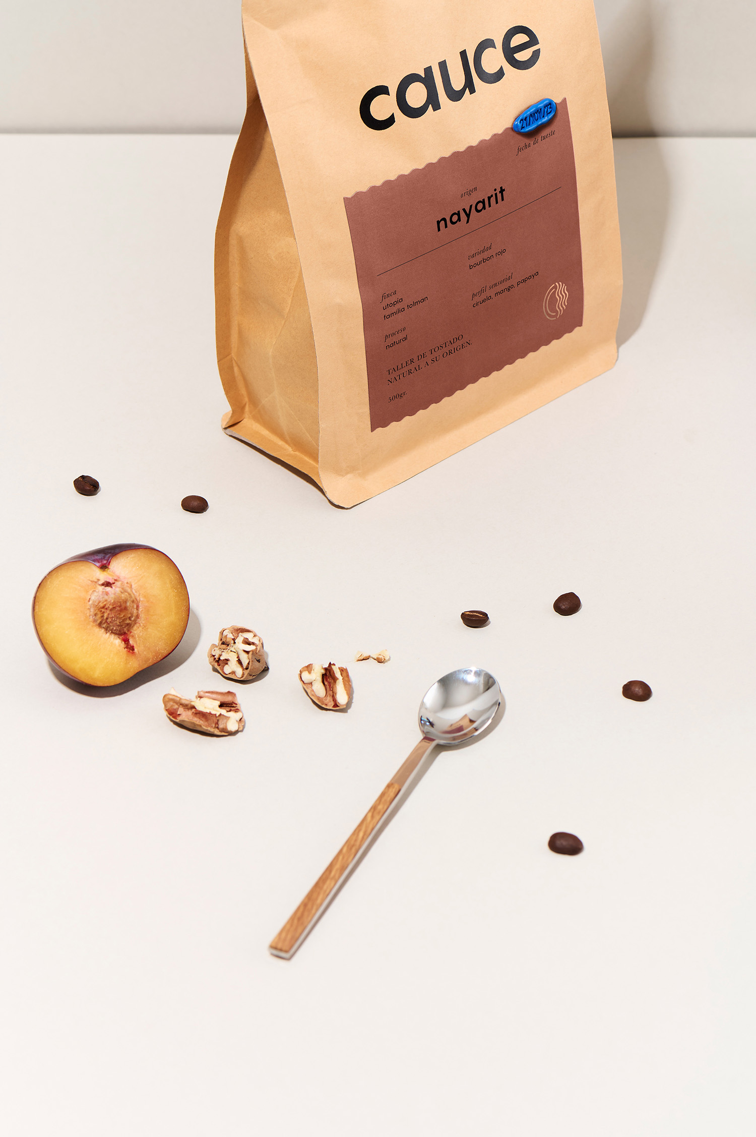
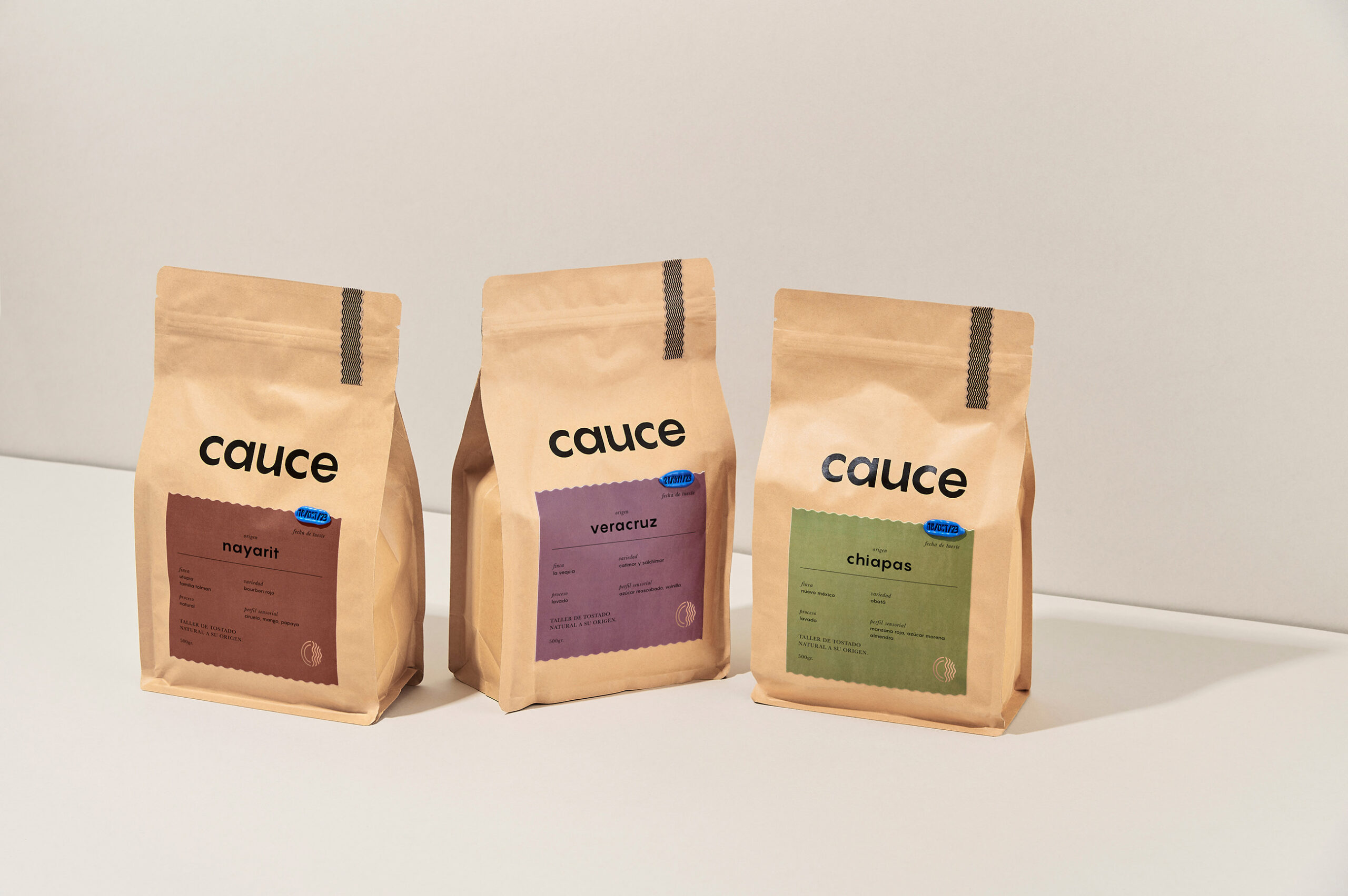
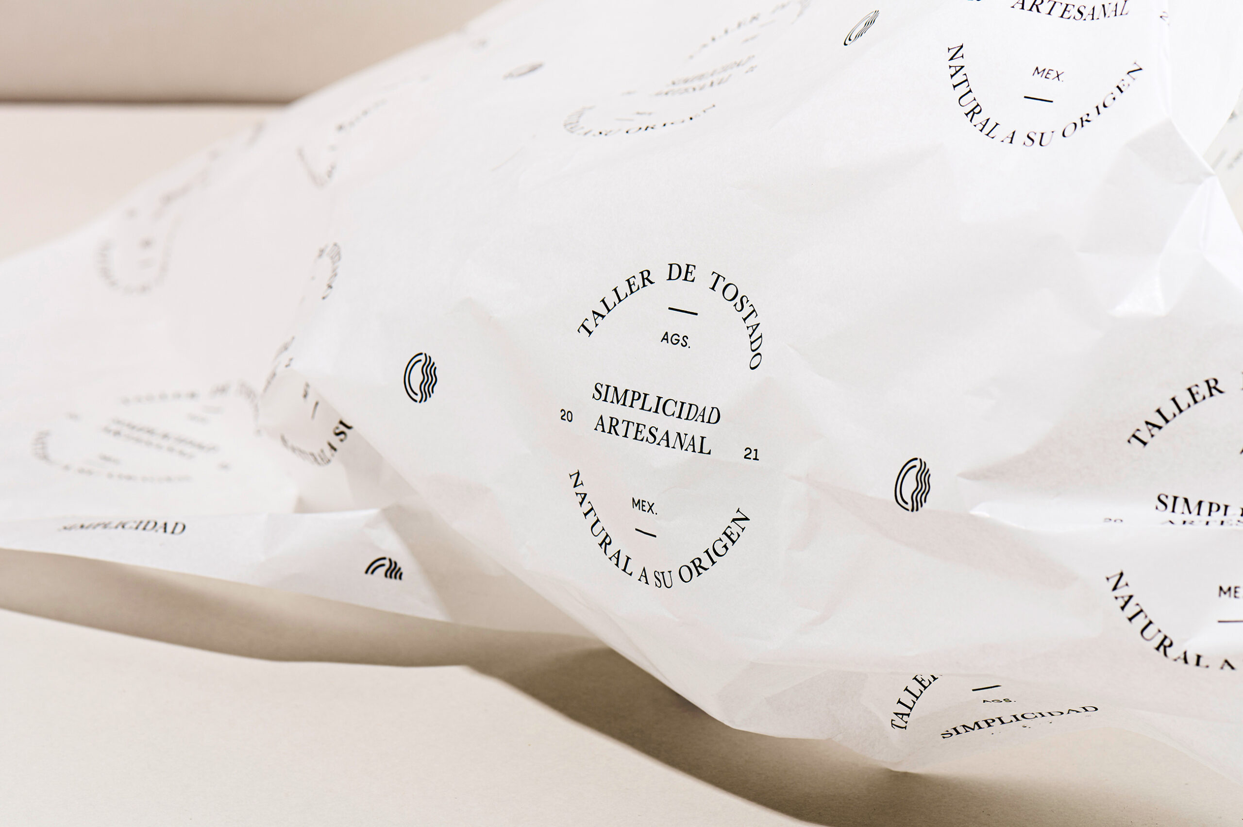
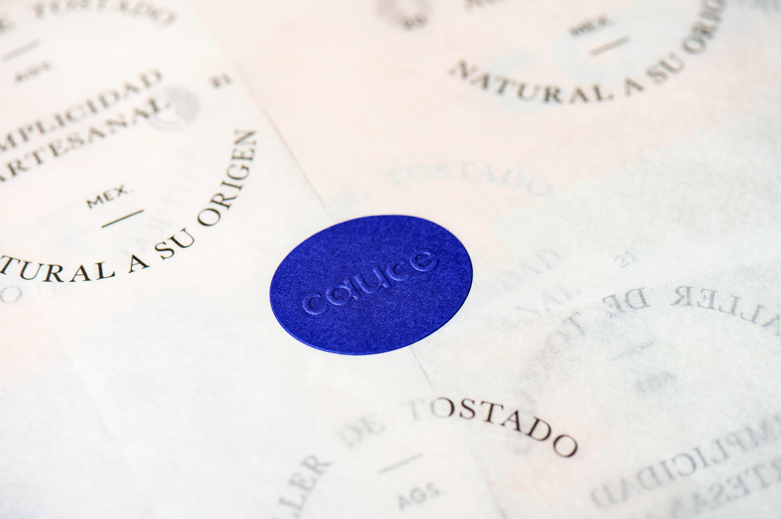
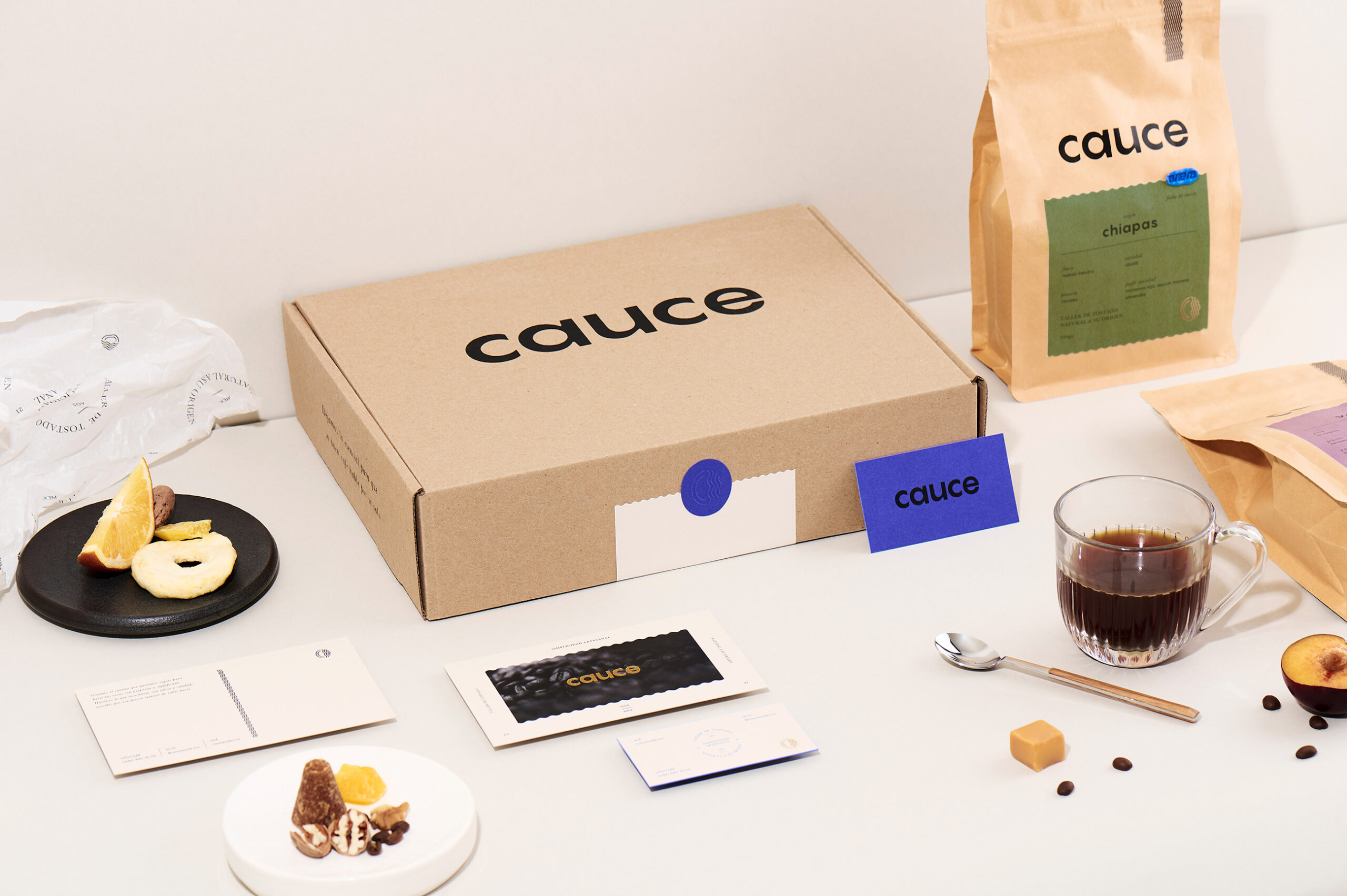
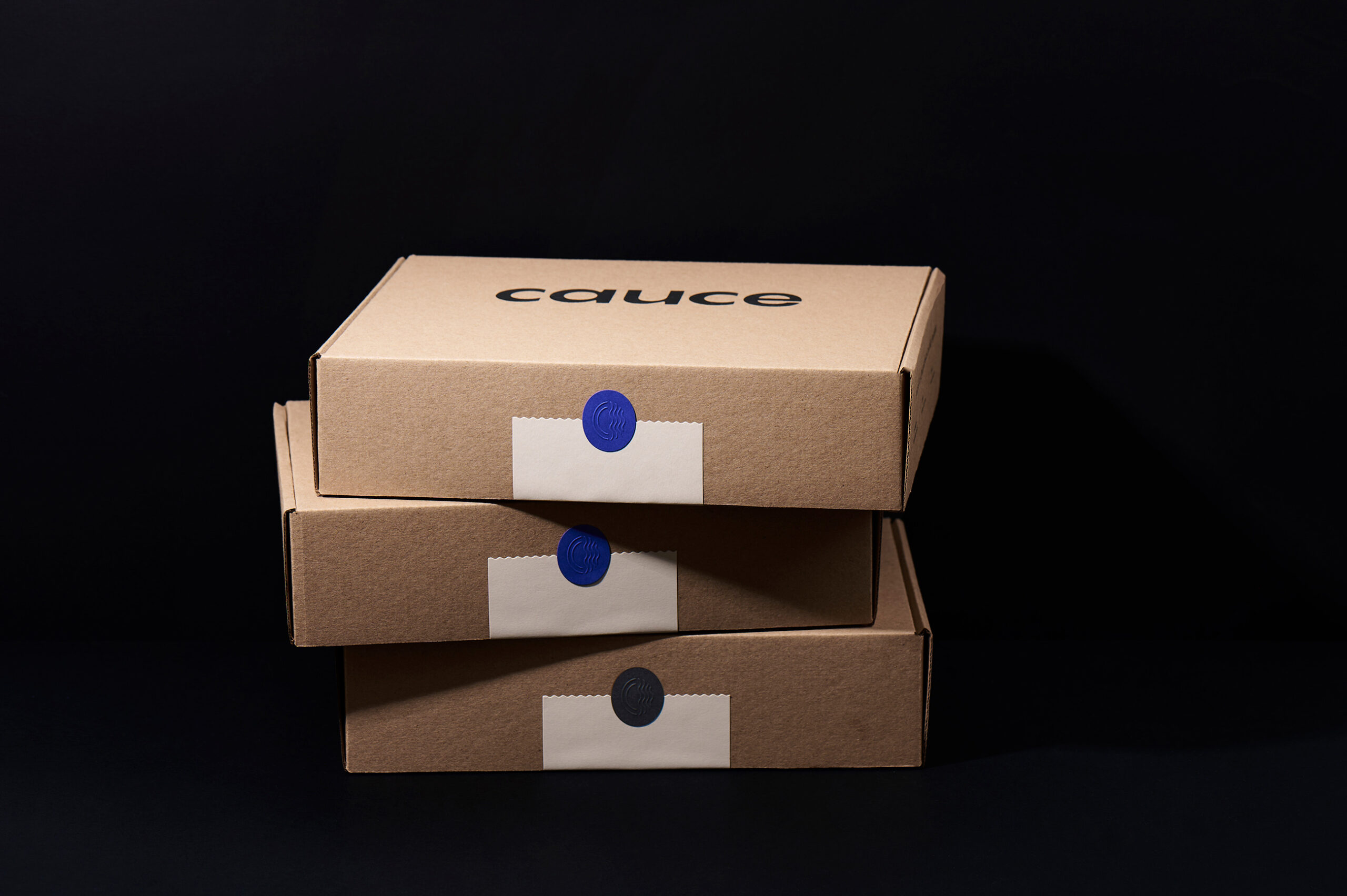
THE PACKAGING
The packaging prominently features a wax stamp that takes the lead, clearly communicating the roast date. A minimal symbol joins the concept of water, coffee, and a letter C. The earthy color palette authentically reflects the origins of each coffee, whilethe typographic system embodies minimalism, emphasizing moderation and purity in design. We developed Naming, Brand identity, Packaging.
We help founders launch their brands with intention, crafting brand experiences that reflect their essence, tell an authentic story, and position them as trusted voices in their industry.
Ready to bring your vision to life? Fill out our questionnaire to get started.
New Inquiries
Visit
Follow
Talk to a Human
+52 33 2641 6051
